 misa
misaこんにちは、ウェブデザインパレットのmisaです。
今回は、CSSでつくる数字のあしらいデザインをまとめました。
どの見出しもHTMLとCSSのみで表示できます。
コピペOKなので、ぜひアレンジして使ってみてください^^

Contents
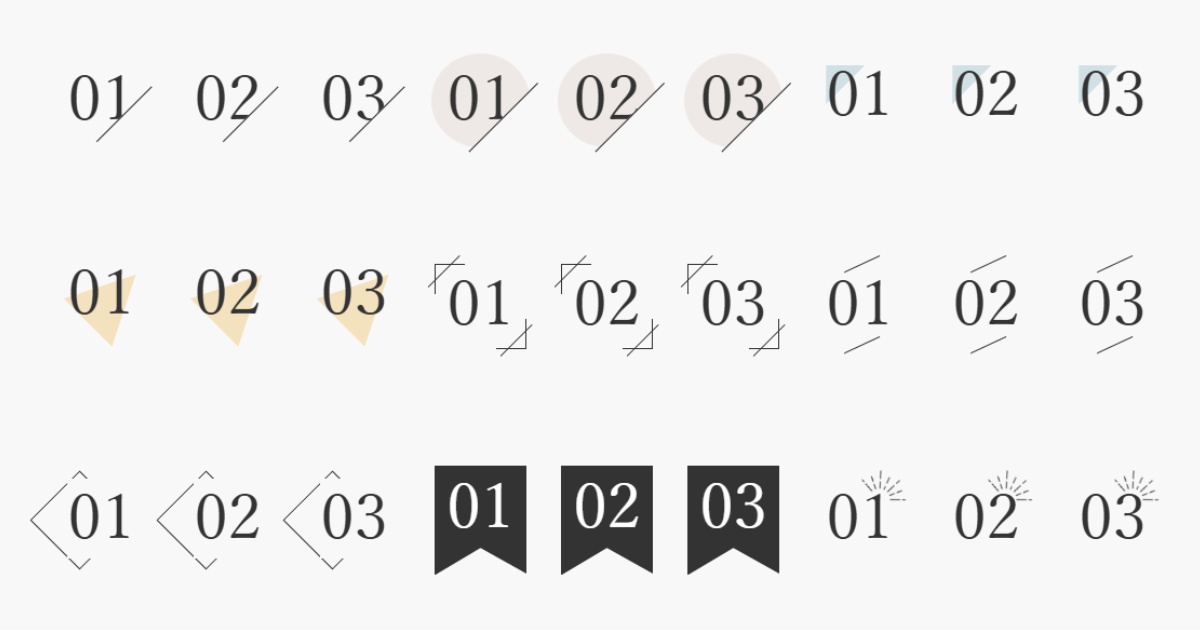
斜めボーダー
01
02
03
コードを表示
HTML
<div class="number-01">01</div>
<div class="number-01">02</div>
<div class="number-01">03</div>
CSS
.number-01 {
  position: relative;
  font-family: 'Noto Serif JP', serif;
  font-size: 64px;
  color: #333;
  font-weight: 400;
  line-height: 1.5;
  display: block;
  box-sizing: border-box;
  text-align: center;
  margin-inline: auto;
  width: fit-content;
}

.number-01::after {
  content: '';
  position: absolute;
  bottom: -20px;
  right: -24px;
  width: 40px;
  height: 80px;
  border-left: 1px solid #333;
  rotate: 45deg;
  background-color: #f8f8f8; /*背景と同じ色に変更してください*/
}
丸背景+斜めボーダー
01
02
03
コードを表示
HTML
<div class="number-02">01</div>
<div class="number-02">02</div>
<div class="number-02">03</div>
CSS
.number-02 {
  position: relative;
  font-family: 'Noto Serif JP', serif;
  font-size: 64px;
  color: #333;
  font-weight: 400;
  line-height: 1;
  display: block;
  box-sizing: border-box;
  text-align: center;
  margin-inline: auto;
  width: fit-content;
  background-color: #eee9e6;
  border-radius: 50%;
  padding: 16px;
}

.number-02::after {
  content: '';
  position: absolute;
  bottom: -34px;
  right: -8px;
  width: 40px;
  height: 100px;
  border-left: 1px solid #333;
  rotate: 45deg;
  background-color: #f8f8f8; /*背景と同じ色に変更してください*/
}
三角の背景①
01
02
03
コードを表示
HTML
<div class="number-03">01</div>
<div class="number-03">02</div>
<div class="number-03">03</div>
CSS
.number-03 {
  position: relative;
  font-family: 'Noto Serif JP', serif;
  font-size: 64px;
  color: #333;
  font-weight: 400;
  line-height: 1;
  display: block;
  box-sizing: border-box;
  text-align: center;
  margin-inline: auto;
  width: fit-content;
}

.number-03::before {
  content: "";
  position: absolute;
  top: 0;
  left: 0;
  width: 40px;
  height: 40px;
  background: #d0e0e5;
  clip-path: polygon(0 0, 100% 0%, 0 100%);
  z-index:-999;
}
三角の背景②
01
02
03
コードを表示
HTML
<div class="number-04">01</div>
<div class="number-04">02</div>
<div class="number-04">03</div>
CSS
.number-04 {
  position: relative;
  font-family: 'Noto Serif JP', serif;
  font-size: 64px;
  color: #333;
  font-weight: 400;
  line-height: 1;
  display: block;
  box-sizing: border-box;
  text-align: center;
  margin-inline: auto;
  width: fit-content;
}

.number-04::before {
  content:'';
  position: absolute;
  top: 30%;
  left: 50%;
  transform: translateX(-50%);
  width: 70px;
  height: 70px;
  display: inline-block;
  rotate: 45deg;
  clip-path: polygon(50% 0, 100% 100%, 0 100%);
  background: #f4e1be;
  z-index: -999;
}
斜線カッコ
01
02
03
コードを表示
HTML
<div class="number-05"><span>01</span></div>
<div class="number-05"><span>02</span></div>
<div class="number-05"><span>03</span></div>
CSS
.number-05 {
  position: relative;
  font-family: 'Noto Serif JP', serif;
  font-size: 64px;
  color: #333;
  font-weight: 400;
  line-height: 1;
  display: block;
  box-sizing: border-box;
  text-align: center;
  margin-inline: auto;
  width: fit-content;
  padding: 12px;
}

.number-05::before, .number-05::after {
  content:'';
  position: absolute;
  width: 30px;
  height: 30px;
}

.number-05::before {
  border-left: solid 1px #333;
  border-top: solid 1px #333;
  top:0;
  left: 0;
}

.number-05::after {
  border-right: solid 1px #333;
  border-bottom: solid 1px #333;
  bottom:0;
  right: 0;
}

.number-05 span::before, .number-05 span::after {
  content:'';
  position: absolute;
  width: 46px;
  height: 46px;
  rotate: 45deg;
}

.number-05 span::before {
  border-left: solid 1px #333;
  top:2px;
  left: 2px;
}

.number-05 span::after {
  border-right: solid 1px #333;
  bottom:2px;
  right: 2px;
}
上下スラッシュ
01
02
03
コードを表示
HTML
<div class="number-06">01</div>
<div class="number-06">02</div>
<div class="number-06">03</div>
CSS
.number-06 {
  position: relative;
  font-family: 'Noto Serif JP', serif;
  font-size: 64px;
  color: #333;
  font-weight: 400;
  line-height: 1;
  display: block;
  box-sizing: border-box;
  text-align: center;
  margin-inline: auto;
  width: fit-content;
  padding: 12px;
}

.number-06::before, .number-06::after {
  content:'';
  position: absolute;
  left: 50%;
  transform: translateX(-50%);
  background: #333;
  width: 40px;
  height: 1px;
  rotate: -25deg;
  display: inline-block;
}

.number-06::before {
  top: -8px;
}

.number-06::after {
  bottom: 12px;
}
ダイヤ
01
02
03
コードを表示
HTML
<div class="number-07">01</div>
<div class="number-07">02</div>
<div class="number-07">03</div>
CSS
.number-07 {
  position: relative;
  font-family: 'Noto Serif JP', serif;
  font-size: 64px;
  color: #333;
  font-weight: 400;
  line-height: 1;
  display: block;
  box-sizing: border-box;
  text-align: center;
  margin-inline: auto;
  width: fit-content;
  background-color: #f8f8f8; /*背景と同じ色に変更してください*/
}

.number-07::before {
  content:'';
  position: absolute;
  top: -4px;
  left: -24px;
  width: 70px;
  height: 70px;
  display: inline-block;
  rotate: 45deg;
  border: solid 1px #333;
  z-index: -999;
}
ふきだし
01
02
03
コードを表示
HTML
<div class="number-08">01</div>
<div class="number-08">02</div>
<div class="number-08">03</div>
CSS
.number-08 {
  position: relative;
  font-family: 'Noto Serif JP', serif;
  font-size: 64px;
  color: #fff;
  font-weight: 400;
  line-height: 1;
  display: block;
  box-sizing: border-box;
  text-align: center;
  margin-inline: auto;
  width: fit-content;
  background-color: #333;
  border-radius: 50% 50% 0 50%;
  padding: 24px;
}
リボン
01
02
03
コードを表示
HTML
<div class="number-09">01</div>
<div class="number-09">02</div>
<div class="number-09">03</div>
CSS
.number-09 {
  position: relative;
  font-family: 'Noto Serif JP', serif;
  font-size: 64px;
  color: #fff;
  font-weight: 400;
  line-height: 1;
  display: block;
  box-sizing: border-box;
  text-align: center;
  margin-inline: auto;
  width: fit-content;
  background-color: #333;
  padding: 12px 12px 36px;
}

.number-09::after {
  content:'';
  position: absolute;
  top: calc(100% - 28px);
  left: 50%;
  transform: translateX(-50%);
  width: 100px;
  height: 100px;
  clip-path: polygon(50% 0%, 3% 28%, 100% 28%);
  z-index: 1;
  background-color: #f8f8f8; /*背景と同じ色に変更してください*/
}
あしらい
01
02
03
コードを表示
HTML
<div class="number-10">01</div>
<div class="number-10">02</div>
<div class="number-10">03</div>
CSS
.number-10 {
  position: relative;
  font-family: 'Noto Serif JP', serif;
  font-size: 64px;
  color: #333;
  font-weight: 400;
  line-height: 1;
  display: block;
  box-sizing: border-box;
  text-align: center;
  margin-inline: auto;
  width: fit-content;
}

.number-10::after {
  content:'';
  position: absolute;
  top: -16px;
  right: -16px;
  background: url("/image.png");/* あしらいのURLを指定してください */
  width: 50px;
  height: 30px;
  background-repeat: no-repeat;
  background-size: contain;
  rotate: 25deg;
}
まとめ
今回は、CSSでつくる数字のあしらいデザインをご紹介しました。
Webデザインの参考になれば幸いです^^
ボタンデザインやフキダシデザインの記事もぜひご覧ください💛
あわせて読みたい
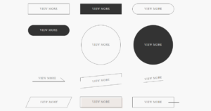
【コピペで使用OK!】シンプルでおしゃれなCSSボタンデザイン(ホバーアニメーション付き)
こんにちは、ウェブデザインパレットのmisaです。 シンプルでおしゃれなボタンのデザインをまとめました。 どのボタンもHTMLとCSSのみで表示できます。ホバーアニメーシ…
あわせて読みたい
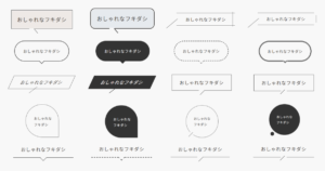
【コピペで使用OK!】CSSでつくるおしゃれなフキダシデザイン20選
こんにちは、ウェブデザインパレットのmisaです。 HTMLとCSSだけで実装できる、おしゃれなフキダシデザインをまとめました。 コピペOKなので、ぜひアレンジして使ってみ…
あわせて読みたい

【コピペで使用OK!】CSSで写真や画像をおしゃれに可愛くデザインしよう!
こんにちは、ウェブデザインパレットのmisaです。 CSSで写真を可愛く装飾する方法をまとめました。 どのデザインもHTMLとCSSのみで実装できます。 コピペOKなので、ぜひ…
では、また~✨